 Through a combination of my own neglect and Google's recent Jagger algorithm update, WebLens had pretty much disappeared off the map by last December. Since then, I have been working intensively to resurrect the site and restore its lost Google ranking. During this time, I have plunged deep into the world of search engine optimization. I don't profess to have all the answers, but I have discovered a few things that are worth sharing here.
Search Engines Hate Javascript
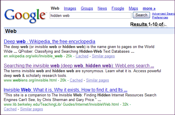
The need to revitalize WebLens prompted a major site overhaul for improved search engine friendliness (and, not unhappily, a better user experience as well). First up, a painful review of the site's flaws, from a search engine's perspective. Topping the list was way too much Javascript which, I learned, creates obstacles for spiders keen to access and index content.
Suitably diagnosed, WebLens began a series of facelifts, starting with elimination of most of the site's Javascript. Cumbersome scripted stylesheet-swapping was eliminated and the unwieldy Javascript menus were replaced by a
CSS design that validates. Search engines don't like Javascript. Eliminating it at WebLens has led to cleaner, stripped down pages that are like candy for spiders and crawlers.
Ad Placement and Format Matters
Happy with the improved functionality of the site, I turned my attention to WebLens'
AdSense ads. These are the reason I keep the site, which otherwise produces no revenue. The ads produce paltry payouts and, ironically, I had never bothered to experiment with the formatting or positioning of them within the page. Now I turned my attention seriously to this subject.
Ad Colours
There are all kinds of "experts" out there who claim to know the secret to AdSense success, for $29.95 plus postage. I think it's a matter of trial and error. Find a balance between ads that leap out at the user and those that recede to the point of obscurity. Most "experts" advise
formatting ads to blend into site foreground and background colours.
I chose to tone down my ads to match the colour palette of the rest of the site. They are still boxed, but not quite so in your face.
Ad Position
Google maintains a
heat zone map that indicates which ad positions on a web page generate best user response. According to this, your ad should be smack dab in the middle of the page. This layout impedes CSS dropdown menus in some browsers (notably Opera, IE 5.00 for PC, and IE/Mac 5.2.3), so I placed my second ad unit vertically down the right edge of the screen.
AdSense lets you create
channels to track ad performance, so I created a separate channel for each set of ads. It only took days to confirm that people click the vertical ad units almost 150% more than the horizontal ad units at the top right of each page. Already my ad revenue is heading toward tripling, and we're approaching WebLens' slowest time of year, traffic-wise.
It's All About Keywords
The final chore is the most tedious, and I can find endless excuses to procrastinate. After revising site look and feel, I was faced with re-writing the content of every page on WebLens to make better strategic use of keywords.
Let's be clear: we're not talking about the Pulitzer Prize. This is writing for search engines. It involves loading your text with relevant keywords while simultaneously avoiding
keyword stuffing, which can get you penalized. It isn't my idea of fun, but it's probably the most important piece of the puzzle. Here's what I've learned:
- Google wants content — lots of it. You can't just present pages as excuses to serve AdSense ads. There needs to be significant content to provide context for those ads. (On the theory that quality content is desirable, not just for search engines, but for humans, I am currently seeding the WebLens pages with brief tips relevant to each page's content.)
- Keywords should be plentiful, but not too plentiful. Aim for a keyword density of no more than 5% per page. Anything over this could be considered spamming the search engines.
- Keywords should be placed as near the top of the document as possible. Put them at or near the beginning of titles, headings, in paragraph text, and in image alt text.
- Keywords used in domain names or other parts of a document URL are given high priority by Google. Use keywords as document names, if possible, but be wary of renaming existing documents that may already be heavily linked to. Check first before you rename.
- Keywords should be unique to each page. Do not use one set of keywords across the entire site. Brainstorm keywords appropriate to page topic, and use them liberally. Online keyword research tools such as SEOBook can help you identify the highest volume and best paying keyword combinations. This is the biggest change I've made at WebLens, and it has paid off royally!
- Word order is important. Give careful thought to how your users are most likely to search and the order in which they type keywords. Vancouver car rentals produces different results than rental cars in Vancouver. Test various combinations in Google before you build your keyword list. (This is where it's helpful to check which combinations are highest paying.)
- Section targets can help Google (and possibly other search engines) circumvent problematic third-party code and to flag keyword-rich passages. Though it was time-consuming, integrating these into my pages has been one of the most helpful changes I have made.
- Strategic links among the documents on your site enhance the user experience by linking to related topics. And, if you're concerned about AdSense revenue, they keep users involved longer and increase the likelihood of click-throughs.
- Meta tags are not as important as they once were (Google ignores them entirely). Nevertheless, don't eliminate them. Some search engines may still acknowledge them. Place document-specific keywords in your document title, meta description, and meta keywords tag.
- [Update] And finally, as one reader has reminded me, the best optimized site in the world won't be found if no-one links to it. Link popularity is a primary factor in contemporary search engine ranking. Watch for more on this topic in the near future.
Length Guidelines
Though the "experts" vary somewhat, here are approximate guidelines re recommended maximum lengths of various HTML document elements.
- Title: 70 to 100 characters max. Bear in mind that Google truncates at 66 characters.
- Description: 200 to 250 characters max.
- Meta-Keywords: 100 words or 1,000 characters max.
One final note: regular updates are important. I paid a steep price for allowing WebLens to languish. With stale content, Google simply stopped coming to supper, some time around July 2005. Getting it back at the table has been a mighty big feat.


 My passion for making fractal art has deepened, to the extent that friends and family are beginning to worry about me. Virtually every evening, around 8:00 p.m. — after spending all day on the computer — I fire up a fractal program, and don't seem to be able to extricate myself til midnight, or later. (At least it's weaned me off the TV!)
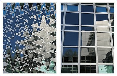
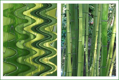
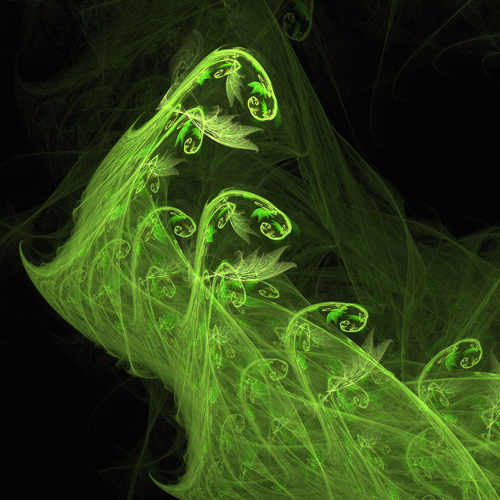 I started out with Ultra Fractal, which I have blogged about here before. More recently, I began wading into the murky waters of a freeware program called Apophysis. The two programs are very different, as are the images they generate. You can often tell a UF image by the bold colours and almost psychedelic feel of the work. Images generated in Apophysis tend to be softer and more delicate, somehow — generally a little more subtle. The image at the top of this post was done with Ultra Fractal. The one to the left of this paragraph is an Apo fractal. Both programs are capable of creating mind-boggling works of art that explore unseen dimensions and seem to probe infinity itself.
 I have recently been experimenting with Ultra Fractal's transformations — special effects you can apply to a fractal. One of these allows you to create a kaleidoscopic effect, as in the example at the right of this paragraph. Other transformations include the mirror ball and shimmering lake effects you see in the first image in this post.


